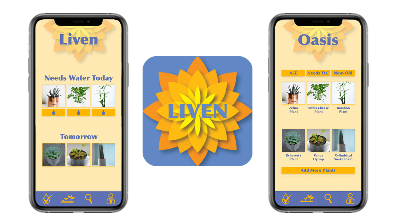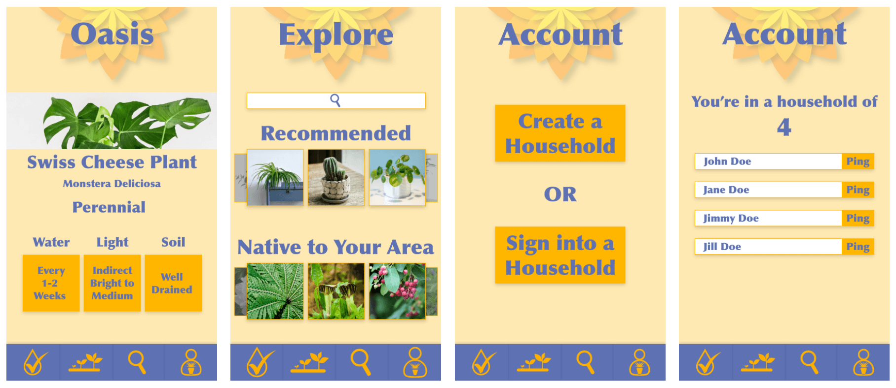
This is a concept for a plant watering app called Liven. The bright orange and blue color palette is meant to contrast with similar apps in the app store. The logo is positioned on the top of each page as a watermark behind the titles so it is apparent but not taking up a lot of space. The menu is on the bottom of the page so it's easy to reach and large so it's easy to tap for many users.

